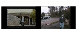
Digital Technology - we first started off by learning how to use all the recording equipment. Our group filmed a short conversation in which we got used to using different camera shots angles and movements. We then used the computers to transfer the footage from tape onto adobe in order to start the editing stage. Adobe premiere elements is the programme used in order to edit out video clips. We were able to add sound tracks to the clips using a free music website which is non-copyright. For our final piece of coursework we followed the same concepts as we did for out first clip. However we discovered several other options in which we could make our clip better in some cases such as adjusting the brightness and contrast for example.
Creativity - our group came up with something new and original by having our own original idea, but using ideas from existing clips such as adulthood for example. By doing this we managed to use the best techniques from a variety of films within a similar genre. If we had the same equipment as the professionals and the resources as well as the time, i think our film could have been vastly improved.
Research and Planning - we found that our main product was puzzled together using ancillary texts with the main piece of the puzzle as it were our original idea; pulling techniques and ideas from other texts. There is obviously room for improvement on the product.
Post-production - our audience feedback gave us the pros's and con's of our opening two minute clip. This was helpful as it shows what immediately stuck out in the audiences minds while watching the video. The con's were good as they allowed us to see where we can improve on the next piece of coursework in which we do. The pros's were also just as good as it shows what techniques we have used which were effective, therefore we can develop on them further making our next project even better.
Using the conventions from real media texts -
Monday, 20 September 2010
Monday, 26 April 2010
Audience Feedback
Below is our audience feedback from our class. We watched our video on the projector and then the members of the class said what they like and what they though could be improved. Our teacher also made a few comments.
Tuesday, 20 April 2010
Evaluation 7
below is our preliminary task:
Looking back at our preliminary task it is clear that we have progressed alot and improved/ expanded our knowledge, as a group this was our first time we had ever filmed and edited properly. We used very basic skills which we have now built on for our Opening Two Minutes only using the 180 degree rule, match on action, shot/reverse shot and high and low angles, whereas now we have expanded to nearly all types of camera angles and shots.
Editing has improved a huge amount also throughout the two tasks, starting with very basic continuity transitions, then into fade in, fade out, creative, fast and slow paced editing to create a mood in which the audience will enjoy or find beneficial whilst watching
As you can see above, both Over the Shoulder Shots are quite different, one from a level angle (basic) and the other slightly more creative and thought up to prove effective when representing social class.
The 180 degree rule is also an important rule you must consider when filming, if you film from the other side of this are the audience will be off put and likely to be dis-orientated. We had to be very careful when filming a conversation in both films as it is easy to step over this line without realising, resulting in a messy confusing scene, likely to put the viewer off.
In the screen grabs above you are able to see the difference and progress we have generally made on the creativity and thoughts behind the shots, using the birds eye view shot or in 'Brother 2 Another' a point of view shot, these both work in similar ways, a birds eye view shot helps the audience to get a general over view on what/where the character is doing/going, in this case going up the stairs. Whereas in 'Brother 2 Another' the point of view shot was used to allow the audience almost see the world through the characters eyes, in this case, experiencing, pain, shock and fright from the mugging, also helping the audience to feel involved in the story.
Close-ups are one of the standard shots used regularly with medium shots and long shots. Close-ups display the most detail, but they do not include the broader scene.
Close-ups are used in many ways, for many reasons. Close-ups are often used as cutaways from a more distant shot to show detail, such as characters' emotions, or some intricate activity with their hands. In this case an in depth sense of shock is made by the shot to highlight the issue of a brutal attack.
Wednesday, 31 March 2010
Evaluation 5
Annotation refer to genre conventions, use of music, similarities and other movies and what you have identified as the Unique Selling Point(USP)of our opening two minutes and imaginary film.
Evaluation 6
What have you learnt about technologies from the process of constructing this product?
We used many different tools and technologies and other media products/kit to help construct our final media product.
We used:
School/Home computers - To edit and upload/update new features onto our blogs.
School supplied camera and tape - We used these film and record our opening two minutes aswell as filming audience feedback and directors commentary.
Microphone - Extension microphone used for our opening two minutes allowing us to get a good quality of sound from the character outdoors.
Tripod - We relied on the tripod for many steady shots to enhance a better quality of filming.
Car - To travel to each different location safely and comftably. (It was freezing)
Ipod - This was used as a prop in our scene of William being mugged, to help illustrate wealth.
Wallet & Keys - This was used as a prop in our shot of expressing the materialistic goods in Williams house as he goes to pick up both items. (match on action)
Phone - This prop was used when William is first introduced showing the audience the contrast on how William has up to date technology at his finger tips.
Fruity Loops 8 Home Studio - This was used at home to construct a suitable soundtrack for our opening sequence.
Adobe - We used Adobe Premiere 8 to edit and construct our opening two minutes aswell as using Adobe photoshop to help put together our screen grabs and complete presentation.
Memory Stick - Using memory sticks as a back up was a good idea incase of any computer errors we all had a copy of our progress, fortunately we didn't have any computing saving errors. This was also useful from travelling information from home to school.
Blogger - We used blogspot blogging to present our research, planning, evaluation and final media product.
Youtube - Finally one of the most useful websites, youtube - we found that it was very helpful when constructing our research and if we needed to see how other openings were presented in a paticular fashion. It was also used for research and easy viewable videos to then evaluate for our research and planning, helping us finalise our genre and target audience.
Below are some pictures of me and some equipment we used:
Monday, 29 March 2010
Evaluation 4
Who would be the audience for your media product?
I believe the typical audience member for our media product would be anyone inbetween the age of 15-24 who likes getting involved with deep storylines which relate to an urban reality of a the diversity between lifestyles of teenagers.
This is Toby, he is 17 and is into graffiti art and bmxing he is most likely to shop at unique outlets such as 'Mash Clothing' in London, who support the youth of today and sell urban styled clothing brands, keeping up with what's new and fresh on the street. Toby is most likely to be found listening to the new form of drum and bass - dubstep, distinguished by it's two-step rhythm, fast beats and kicks are exactly what Toby lives for. Toby's favourite sort of TV programmes are going to be orientated around music such as; MTV and TMF channels, although he is likely to watch relating teenage series such as 'The Inbetweeners' and 'Skins'.
From this i am able to understand tobys likes and use them positively to help our film stand out to him. As Toby is keen on Music we could involve him and his social group with soundtracks to our film as did 'Adulthood' using Pathe institution when distributing their film they; used music as it has a huge influence on the target urban 16-24 year old audience. Their strategy was then to leverage this passion for music and tap in to the viral nature of social media to build credibility for the film, and generate early hype among a new 16-24 audience.
The film had to feel niche, real and about them so the challenge was to talk to them on their level by infiltrating their worlds to give the film credibility.
Evaluation 3
What kind of media institution might distribute your media product and why?
I believe Pathe would be an ideal media institution to distribute our media product because..
Directors Commentary
Pathe has a major presence in the UK film industry, operating as a fully integrated studio. It is involved in all aspects of film-making, from production and development all the way through to international sales and distribution. Pathe is one of the leading distrubutors and producers of films in both the UK and France.
Directors Commentary
Evaluation 2
How does your media product represent paticular social groups?
Above is a screengrab of Jack's friend (deprived), as we have only three main characters who all play a major part in the opening i decided to pick Jack's friend, to help illustrate and represent the deprivation of certain characters and their social groups within urban, drama films, for an example i have screen grabbed an image of actor Adam Deacon playing Jay in Adulthood.
Both characters represent the lower class citizen - stereotypically known for involving theft, violence and drug abuse into their day to day lifestyles, helping them to get by and cope with the struggle and strife they go through.
Both Jay and Jack's friend have a similar dress code of jeans and hoody a typical teenage 'yobby' look about them, with a lack of self respect likewise representing themselves as 'whatever guy'. The style in which they are dressed is easily recognised by the audience helping them apply specific information into how they should generalise the character. Also easily recognisable is body language, most audience members will pick up on body language sub-consiously being able to identify or judge characters accordingly. In this case - Jay has a slouched body posture, with arms swung wide, as though to appear bigger than normal, head held high with a facial expression, appearing cocky and confident to over-compensate for his size. Whereas Jack's friend has a similar attitude with broadened shoulders to over-compensate for his size, with his hood up covering him from being identified and related to a crime scene.
Evaluation 1
In what ways does your media product use, develop or challenge forms and conventions of real media products? (i.e. of film openings)
-Select 9 distinct frames(screengrab)
-Post and evaluate
-Aspects to consider - Title, Location, Props, Editing, Title Font/Style, Story set up, Genre -how suggested), introduction of characters, special effects.
These are my nine screen grabs of our final piece that I have chosen to evaluate and write about how they are typical or not of opening sequences of the same genre.
Frame 1 - The title of the film: Our title of the film is set on a black screen, like the majority of urban films i have evaluated, i believe starting on a black screen allows the audience to be drawn in and want to see how the film starts without giving it away to early, i believe this technique builds tension towards the actual film and allows the audience to focus on the title of the film, in our case helping them to understand the storyline, without giving away anything interesting persuading them to keep on watching. The red styling of the '2' gives the sense of blood, fright and danger between both brothers.
Frame 2 - Setting/Location: Our screenshot is of 'Williams house' to help illustrate the wealth of his lifestyle this long shot of the house establishes the paralell editing of two very different, diverse lifestyles allowing the audience to identify with the setting. Establishing shots are very popular when setting scenes and locations especially in drama genres helping the audience to identify with the story.
Frame 3 - Costumes and Props: This screengrab is of an 'ipod' an easily identifiable object worldwide to show wealth which plays a major role in our opening linking the two brothers and illustrating the differences between their diverse lifestyles of wealth. This prop is highlighted as a major object.
Frame 4 - Camera Work and Editing: This shot is of William dipping his shoulder as to enter the room, the editing of this was carefully done, to enhance the 'match on action' as William's shoulder dips into the room immediately as it is picked up. When doing this we had to mark out how big the steps taken were going to be and which foot and shoulder (left or right) would enter first. By constructing a smooth match on action, by this adds to the proffessional finish of the film. In this shot we used the tripod to enhance the stability aswell as using hand held due to the awkward positioning in the entered room, i believe we have tweaked this shot to the best of our ability and used the camera positioning and transaction editing to the best we could.
Frame 5 - Title Font and Style: I believe this screen shot identifys the title font and styling in which we decided to use to help illustrate the genre film, incorperating a bold basic font, commonly used in drama films then adding a glowing shaded effect around the words to emphasise the unaccompanied production company, highlighted with the black background to be clear, simple but an effective use of title styling to stand out to the audience.
Frame 6 - Story and how the opening sets it up: This screen grab in which i chose; i believe represents the story and how the opening sets up best contrasting two types of characters, one deprived and one wealthy, unfortunately there is no scene in the opening two minutes in which both brothers meet, although i think this is the shot that best illustrates the story - The deprived boy steals the wealthy boys ipod this outlines the main story, of the contrasts of lives, almost as though the deprived boy steals off the rich boy to stay alive, by buying food and drink, at which point the wealthy boy doesn't realise how he is supporting his long lost brothers' life starting to link the brothers in the opening two minutes. Now leading on with the rest of the film, to show both brothers growing up in completely diverse lifestyles and how they come across each others paths positively and negatively.
Frame 7- Genre and how the opening suggests it: The screenshot which i chose best identifys a contrast in lifestyles as this is the second two-shot of both characters.
I believe this helps illustrate an urban, drama style film, relating to reality and the ups and downs of life it self. Mise en scene also helps suggest the genre by using costume i.e. Wealthy boy - smart/casual clothing, Deprived boy - Scruffy hoody and jeans. Both with very different body language, a polite, well postured walk from the wealthy boy, suggesting his wealth and upper class lifestyle, whereas the body language given off from the deprived brother is almost opposite; bad postured walk, head down, hood up, rough expression. By incorperating a prop (the ipod) this helps to give the audience an even clearer understanding of who's who. As an ipod is not a necessity but a luxury only the wealthy character would have one, suggesting a life of luxury.
Frame 8- How characters are introduced: I have chosen the screen grab of Jack in the shop, putting a chocolate in his pocket, i believe this best identifies his introduction into a deprived lifestyle, illustrating theft as a way to get by. Immediately identifying one lifestyle, therefore soon to come will be an introduction of a different lifestyle, able to help the audience contrast and compare the differences applying positives and negatives and the obstacles in which the long lost brothers have to deal with, crossing the paths of one and other, dealing with life in their different ways. An introduction of paralell editing is often used in urban, drama films to clearly identify the differences between up to several characters.
Frame 9- Special Effects: The screen grab i chose which i believe best shows our effects is after the wealthy boy (William) gets mugged for his ipod, left against a fence shook up and bloody, the blood we used was fake fortunately as i didn't fancy getting beaten up, whilst playing the character. As a low budget film, very little 'special effects' were used, consequently i found it hard to find a suitable screen grab. The effect of blood, is commonly used in films, to illustrate empathy or shock to the audience, suitably as the average audience member may be drawn into the attachment of characters and fight scenes suggesting social hierachy of the characters commonly used in urban, drama films.
In our opening two minutes, media product, i believe we have used many tools and techniques to help support and clearly suggest the urban, drama genre.
Script
Jack's friend: Jack wake up, look what i got!
Jack: Where dya get this?
Jack's friend: Yeah i nicked it from posh kid init.
Jack: C'mon let's go now and sell it.
Jack's friend: Standard
Jack: Where dya get this?
Jack's friend: Yeah i nicked it from posh kid init.
Jack: C'mon let's go now and sell it.
Jack's friend: Standard
Saturday, 20 March 2010
Friday, 19 March 2010
Video.
We are struggling to upload the video onto Youtube at the moment. As the file is so big it is taking too long to upload, therefore we need a faster computer in which we can upload the video. We plan on putting the video onto a memory stick and then taking it home to upload it.
Wednesday, 17 March 2010
Official Soundtrack
After debating over the previous soundtracks we found inspirational, we understand that we are more likely to get better marks once introducing either - non copywright music, or homemade soundtracks, for example, i play around on 'FruityLoops8' quite alot, which is a music making program, i think we have decided to sit down and construct our own soundtrack similar to the last inspirational music 'Skrein - Reach (instrumental).
Inspirational Music
This is my favourite possible soundtrack so far, i believe the intro lasts long enough to introduce the characters then as soon as the faster pace drum beat comes in we could be showing the 'Deprived brother' living his more urban lifestyle.
Monday, 15 March 2010
Inspirational Music
This song would possibly fit well, i feel the piano beat builds up tension, for example the wealthy boy being robbed in our opening two minutes, this could then drop into a faster paced beat, keeping the audience on edge, within the opening two minutes.
Inspirational Music
This seems as though it could be an ideal soundtrack as it is quite a grimey instrumental, i believe the piano sound is effective when contrasting to lifestyles, the piano representing the wealthy brothers lifestyle and the drum beats representing the deprived brothers lifestyle.
OCR Media Studies G322 - Evaluation
In what ways does your media product use, develop or challenge forms and conventions of real media products? (i.e. of film openings)
Aspects that must be considered:- (9 distinct frames, screengrabbed, anatate, typical opening sequence?
Title of the film:
Brother 2 Another
Setting/Location:
Lower Ashtead Parade,
Ashtead Railway Alley,
Skinners Lane
Costumes and Props:
Ipod Classic & Headphones
Blue Sleeping Bag
Scruffy Clothing (Deprived brother and friend)
-Hoody and Track suit bottoms
Upper class clothing (Wealthy brother)
-New Trainers, New Jeans, Smart Coat, Polo Shirt, Wallet, Keys.
Camerawork and Editing:
Hand held, Adobe Premiere, Contrasts of lives.
Title font and style:
Times New Roman, glowing white, 2 = red.
Story and how the opening sets it up:
Contrasts of lives, poor steals from rich, Brothers split at birth.
nice lifestyle, rough lifestyle.
Genre and how the opening suggests it:
Music - urban
Stealing - grimey
Sleeping rough - homeless
Nice house - Blatent contrast
How characters are introduced:
How they live their lives,
Wealthy boy, comfy house gets up and goes out, dressed casually smart.
Deprived boys, under a railway crossing/alley way.
Special Effects:
No special effects.
Budget - Nothing
Editing - Time Management
We are currently editing the opening 2 minutes of our film on Adobe Premiere 8, unfortunately the computers we are working on them, are fairly old, consequently finding it hard to process the program, so progress is slow but steady!
At first we were worried we wouldn't have enough footage, although once all the filming had uploaded we had 5 minutes extra. This was a relief in that we didn't have to go and film anymore, although a sigh of the long process of cutting back.
After a lot of hard work editing we have finely cut down the film, trimming bits, now having DEAD ON 2 minutes, such a relief. Although having to ensure we didn't go over 2 minutes, we had to cut some shots out, leaving us with a slightly altered opening two minutes to our original film treatment. We are all very happy with our film at the moment, and believe that it is easily understandable and still follows the guideline of our film treatment sufficiently.
Filming
We went out filming today not really knowing what to expect, so we thought we would play things safe and generally film as much as possible, worrying we wouldn't have enough. 9am - 5pm
First obstacle - Lots of moving, parked cars. We overcame this obstacle by waiting around for temporarily parked cars to move, although generally taking the risk that we wouldn't have to re film certain bits, we made sure that whenever possible we didnt get any vehicles or pedestrians in the shots.
Second obstacle - In our storyline the deprived brother steals a chocolate from a newsagent, we weren't necessarily sure on wether the shop owner would let us film in her shop, although after a bit of persuasion she let us film, whilst there were no customers.
Third obstacle - Typically there was a recording error whilst filming in the newsagent, unfortunately we only realised this when we had got back to my house, luckily just up the road, after the embaressment we came back to the shop to re-film, luckily everything ran smoothly second time round.
Fourth obstacle - The video camera we were using ran out of battery, stopped by Daves house to warm up and let the camera charge.
Final obstacle - The change in weather, luckily the sleet came gradually and slowly, fortunately not effecting any of our shots paticularly. Although it was freezing cold and became hard to focus, although we all managed to survive.
We came across five obstacles all together, however i think we coped well and thought logically, allowing us to move on and carry on filming consitently.
Friday, 5 March 2010
Evaluation - Changes made from our original plan
When we filmed we aimed to stick to our original story board as much as possible, also we filmed a extra few scenes to have if possible incase our filiming didn't last two minutes. However once we uploaded our final
Current Progress
We are making steady progress as our editing of our beginning two minutes for our film is near completion, soon i will be able to make a personal evaluation of the work we have achieved. We attempted to resemble our storyline as much as possible in our opening two minutes and follow the storyline as closely as we could, however because of time lengths requirements this wasn't always possible. Two ensure our video was 2 minutes longs some shots had to be cut out, consequently slightly altering the main outcome of two minute clip.
Tuesday, 23 February 2010
Audience Profiling
I looked at 3 films that i thought were quite similar to mine and looked at their audience profiling using the Pearl & Dean website. I did the research so that i can make my film specific and suitable for our target audience.
Parent Trap - Its target audience were families. Their focus was 15-24, both to male and female. Their cultural audience was 25+ ABC1.
Twins - There target audience were families. Their focus was 15-24 year old, both male and female. Their cultural audience was 25+ ABC1.
Somers Town - Its audience was families. Their focus was 15-24 year old, both male and female. Their cultural audience was 25+ ABC1.
I found these three films were most similar to the opening film in which we are producing, leaving me with a good generalised understanding on the target audience we should aim at. Suprisingly all films came under the same target audiences, giving us a well supported structural understanding on the audience we should target in our opening two minutes.
Monday, 15 February 2010
Institution research
The UK Film Council (UKFC) was set up in 2000 by the Labour Government as a non-departmental public body to develop and promote the film industry in the UK. It is constituted as a private company limited by guarantee governed by a board of 15 directors and is funded through sources including the National Lottery.
It has 3 types of funding schemes. Development Funding, which has £12 million to invest over 3 years , with a £25000 maximum award. The New Cinema Fund supports emerging talent and established filmmakers working outside the mainstream, focusing on the most innovative writing and the most gifted directors. The fund has £15 million of Lottery money to invest over three years and funds eight to ten feature films each year.The Premiere Fund invests £8 million of Lottery funding per year into mainstream, commercially-driven films encouraging the involvement of British creative talent in a range of films that can attract audiences the world over.
Another british based institution is 'Working Title'. This is A british film maker, but is funded by American's. Therefore doesn't count as British as it doesn't have British funding. But nevertheless, the majority of the filming Working Title does is in the UK, with British actors.
Friday, 29 January 2010
Shot Types
Name of production compony ontop of black screen. No digetic music. Middle of the screen, title sequence shot.
As BBW slowly fades out, Uk Film Council slowly blends in still ontop of black screen, non-digetic music then slowly begins.
Mid-shot, clip fade's in at a medium pace, music still playing to keep in background to keep continuity, however some digetic sound being heard for realism and to set the scene - mid shot of boy walking.
Same shot and sound, however as the name of director is faded out, the edited by will be faded in at a medium pace in order help maintain a steady pace so that it easy to watch without getting to boring.
Again fast/medium cut between shots, same sound - continuity, this time he's got slightly closer to the camera - inbetween mid shot and close up.
Fast/medium cut to an establishing shot of the boy arriving and walking into a shop. The same digetic and non-digetic sound played to help continuity however all non-digetic sound begins to fade out towards the end of of shot. Establishing shot.
Cuts to mid-shot of boy side on facing towards shelves. All non-digetc music quickly continues to fade completely out. Only digetic sound herd, very slowly begins to zoom in towards end of shot - however only a little.
The next shot is a close up of the top half of the boys body showing precise movements of him picking up food off the self. Still only digetic sound heard.
Another close up this time showing the mid-part of his body putting the food into his pocket, creating the impression he is going to steal it.
Similar to previous shot of establishing shot, this time showing the boy quickly walking out.
It then cuts to another establishing shot, of where the boy is living, shown through a high angle, representing his deprived lifestyle. Portraying his habbitatt in a negative light.
Then it will cut to a close up/ mid-shot of him standing next his belongings and sleeping bag, very slightly zooming in. Eye level (more of personal level) used to creative simpathy for the character. The glum surroundings are used creat a poor deprived atmosphere (use of mise en scene).
Then creating a contrast in charachters, a low angle shot is used to show a wealthy looking boy (this is the other brother). Use for mise en scene, we are going to film him walking down a road listening to an ipod, with large expensive house's in the background. Mid-shot, low angle, long shot of house's in the background.
Then cuts to a shot of the 'rich' boy walking past an obvious poor boy sitting on a bench, 'William the wealthy boy, gives him a clear smugg look and throws the remians of the sandwhcih he's eating in the boys direction towards his feet. This will be shown through about 3 different the first one being a two shot, then cutting to a close up of William face clearly showing his expression towards the other boy.
To then emphasise on the boys wealth, there will be a close up of the ipod, also representing on the difference in wealth between him and the poorer boy. This will only need a quick close up.
It will then cut to a mid-shot of the 'William' walking along from in front of him, showing the poor boy in the background get up and beginning to follow him.
It will then follow into a different two shot from a slightly closer angle. The poor boys intentions are now made clear as he attempts to make a grab for the ipod and push the 'William' to the ground.
Quickly cuts to a side on view to clearly show the two boy's tasseling, mid-shot/ two shot, sound emphasing more on fight, no non-digetic sound.
Continuing in to close up/ mid-shot of the rich boy falling after being pushed, non-digetic music slowly begins again.
Extreme close up of feet (birds eye view/point of view), still shot lasting for 4 seconds lack of movement makes the shop seem slow. Slowing down to create depth of in the story and create emotion.
Then alternatively cutting to a quick shot of the poor boy running away, creating a difference in emotionall state of the two boys.
Then cutting time, goes to shot of the poorer boy coming back to the place where the original shop thiefs is living (the wealthy's brother). Two shot showing a connection between the two people, they are equal however a high shot representing that they are both poor and dont that they are looked down on in society. Although they're commiting crimes, it's portrayed in a manner that makes you sympathize with them.
Then cuts to a simliar shot of the rich boys shoes once again. Immideatly taking you back to the previous fight scene. It pan's up his body, eventually showing the pain in his face.
Then shows a mid-shot/ long-shot showing the lonliness and dark cold surroundings of the rich, fortunate boy now suffering like you imagine the homeless childs do every night. Then the screen goes black and the film name comes up.
Screen Grab - Fight Club
I like this scene as it is totally one sided, and is the start to the main theme of the film. I want to use something like this as in my first fight scene William gets a pasting, but later on in the film becomes more respected as the character in this film does, just in a different way.
Screen Grab - AdULTHOOD
This is the fight scene from AdULTHOOD, i like this screen grab as it shows a big character being over thrown. This is also a good scene as the two brothers are reunited.
Time Management
We plan to start filming two weeks today, on this monday we all only have a few lessons so it is an ideal time to get as much filming done as possible. We plan to film as much footage as we can therefore have enough to edit and play around with to complete are opening two minutes. The main advantage to filming everything on one day is the lighting will be the same and consistant throughout the two minutes, any external factors will be easier to keep the same, such as; costumes, make up and any other surroundings for example - movement of parked cars at the time of filming.
Tuesday, 26 January 2010
Time Managment
We plan to start filming two weeks today, on this monday we all have 1 or 2 lessons so is an ideal time to get as much filming done as possible. We plan to film as much footage as we can therefore have enough to edit and play around with to complete are opening two minutes. The main advantage to filming everything on one day is the lighting will be the same and consistant throughout the two minutes, any external factors will be easier o keep the same, ie costumes, any make up used, and other surroundings, e.g cars parked in the road when boy is walking down.
Monday, 25 January 2010
Similar films - Twins
Parent Trap is a more light hearted story than our own, however still shows the seperated ubringing of two twins similar too our storyline. The two twins Annie and Hallie´s parents divorced when they were infants, each parent taking custody of one twin. Neither twin knows about the other's existence until a chance meeting at summer camp. However unlike this in our film niether twin ever gets a chance to meet one another, more of a tragic ending.
Tuesday, 19 January 2010
Rating & Target Audience

In our film we have chosen to guide the film along the '15' rating allowing us to identify the traumatic gritty scenes we wish to express. Below are the guidelines in which we must felow to consider the film efficently a 15+ aimed target audience.Discrimination The work as a whole must not endorse discriminatorylanguage or behaviour.DrugsDrug taking may be shown but the film as a whole must notpromote or encourage drug misuse. The misuse of easilyaccessible and highly dangerous substances (for example,aerosols or solvents) is unlikely to be acceptable.HorrorStrong threat and menace are permitted unless sadisticor sexualised.Imitable behaviourDangerous behaviour (for example, hanging, suicide andself-harming) should not dwell on detail which could becopied. Easily accessible weapons should not be glamorised.LanguageThere may be frequent use of strong language (for example,‘fuck’). The strongest terms (for example, ‘cunt’) may beacceptable if justified by the context. Aggressive or repeateduse of the strongest language is unlikely to be acceptable.NudityNudity may be allowed in a sexual context but withoutstrong detail. There are no constraints on nudity in anon-sexual or educational context.SexSexual activity may be portrayed without strong detail.There may be strong verbal references to sexual behaviour,but the strongest references are unlikely to be acceptableunless justified by context. Works whose primary purpose issexual arousal or stimulation are unlikely to be acceptable.ThemeNo theme is prohibited, provided the treatment isappropriate for 15 year olds.ViolenceViolence may be strong but should not dwell on the inflictionof pain or injury. The strongest gory images are unlikely tobe acceptable. Strong sadistic or sexualised violence is alsounlikely to be acceptable.There may be detailed verbal references to sexual violencebut any portrayal of sexual violence must be discreet andhave a strong contextual justification.
Costume Choice
We have decided on a costume for the person who mugs William. They are all quite old shabby and have stains on from various things. We thought this would give a good stereotype for him, as then the audience would see him as a lower class, which he is and can be seen by his actions in the scene he is in.
Props
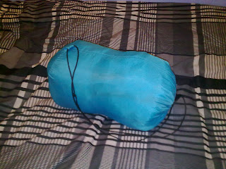
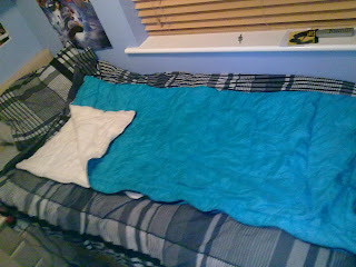
This is the sleeping bag we are going to use in the scene under the bridge. We thought it would be good as it is quite an old looking thing and an old style of sleeping bag.
This is the iPod which belongs to William. It is stolen from him when walking through the park by a stranger, who takes it back to Jack to sell it or show it off, we havent discussed that yet.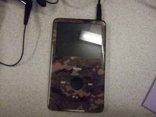


This is the iPod which belongs to William. It is stolen from him when walking through the park by a stranger, who takes it back to Jack to sell it or show it off, we havent discussed that yet.

Thursday, 14 January 2010
Detailed summary of opening two minutes
The first thing to appear on screen during our opening two minute film is the UK film council logo, then the name of our production company, e.g. BBW production. the film will then roll through all the names of various crew members, such as the editor, sound editor, the director etc, while introductory music is being played. During these titles there will be a long shot of one of the male characters walking (jack). This is the start of the introduction to the first character. It then gives an establishing shot of a shop (not decided on which one yet.) The character can then be seen in an extreme long shot walking into the shop. The music then fades out, and the camera shot changes to a mid shot of the character from behind, it watches him look around, acting a bit suspicious. A long shot of him browsing the shelves, then switches to an extreme close up of his hand putting something into his pocket. The camera then follows him out the store, and music starts to build up again. The camera then switches to a long shot of the character leaving the store, here match on action will be carried out, during the editing stages. The scene is then changed to a dirty area under a bridge or steps. There is two props here a sleeping bag, and a rucksack. The same character then enters the scene still using a long shot. He then sits down and gets comfortable, camera switches to close up of him shovelling the stolen food into his mouth, this is to represent hunger and desperation, therefore the audience may empathise with him.
Now the introduction of the other male character (William). He is introduced with an establishing shot of a larger than average, modern house. Diagetic sound of shouting/arguing can be heard coming from the house. A mid shot of the character then leaving the house through the front door. He slams it shut (emphasised diagetic sound of door slamming). He then runs up the road, a long shot is used to view the scene. The camera movement tracks him as he is running, having a mix of close ups on his face and shots of his feet to emphasise his frustration and feelings. The camera follows him for about 20-30 seconds, until he stops exhausted, he bends over to catch his breath a long shot is used from the camera. He then lifts his head up as he hears the voice of his step father behind him, a close up is now used. He begins to run again, he reaches the park. and hides in the bushes. a long shot is used filming him looking around worryingly for his step-dad. He then walks out the bushes, and walks down the pathway.
Another character is now introduced with a long shot. He is sitting on a bench in the park, where he is having a cigarette, looking quite happy with himself. A close up of his face is then shown, as he looks to his left to see William walking towards him. A point of view shot is now used from the new characters angle. William is minding his own business, with his ipod headphones in (music will be played as if William is listening to it, when cutting back to the new character the music volume will go down, to give a bit of realism). He then pulls out his ipod to change the song. A mid shot is now used. The shot then changes to a close up of the new characters face, showing jealousy. A close up of the ipod. A two shot of the two characters. One in front walking towards the camera, then the other guy jumping up off the bench, running at the other character. A mid shot of him snactching the ipod, the punching him. William then falls backwards. The other character runs off, a long shot is used and the camera stays stationary as the character gets further and further away. Camera then cuts back to William curled up on the floor in pain, cutting back to the other character running away then back to William on the floor. Music will then kick in again and the film name will appear on screen. End of two minutes.
Wednesday, 13 January 2010
Character Profiling
Actors
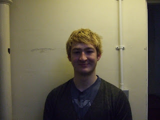
Wealthy Brother - Max will be acting as the wealthy brother we have as a group selected each other, Max has been selected for this part in our film as he is well manored and has a suitable posture. Therefore giving off the best impression to the audience. As this is the main character, we though it best that we had the best actor performing this part.
Deprived Brother - Tom will be acting as the deprived brother this will be a suitable part for him to play as it then allows us all take turns in filming as the scenes are two characters on at one time.
Deprived Brother's Friend - I will be acting as the deprived brother's friend this will be a suitable part for me to play as we then all take turns in filming as the scenes are two characters on at one time.
Monday, 11 January 2010
Tuesday, 5 January 2010
Location
We as a group have been discussing many locational ideas and have come up with the choice of two setting of where the financially deprived boy will be filmed and have currently agreed on using Dave's house to film the wealthy boy. Two Current Options for deprived boy's location; Both located under bridges, the first one is located in Ashtead not far from my house, which might be considered useful to have as a base for equipment and editing, this alley way which can be shot from both ends as it is a straight clear walk through. 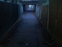
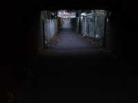
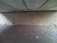
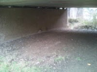


The second location; in Leatherhead slightly more out of the way, along side the river mole, it is slightly more dusty and open to the public allowing more sunlight in, which i think we might not want, as the deprived boy will be based around dark, depressing colours to set the mood and character persona.


Introduction to poor boy, he steals from shop..
Costume ideas
Deprived Brother
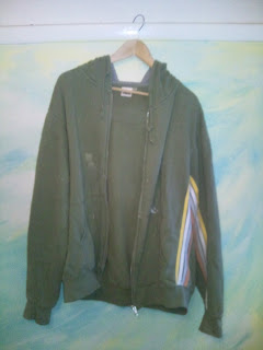
In our opening two minutes we must portray the deprived boy as an ungroomed, scruffy character. We have narrowed down our ideas for the characters outfit, thinking about all the possibilities of generalisations as though to have a stereotypical view on the character to be easily identified by the audience.We have decided upon this hoodie to be worn by the deprived brother as it is scruffy with marks of paint on it,

we also decided on a specifically plain t-shirt as this will be covered by the hoody.
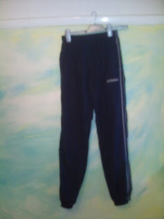
Tracksuit bottoms which are also stereotyped to be worn by a specific casual tatty person;

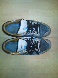
These are the trainers we have chosen to use for the deprived brother as they are scruffy and not well looked after, or worn therefore identifying his wealth with a lack of new footwear.

Wealthy Brother
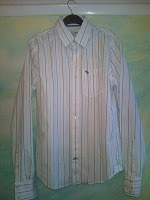
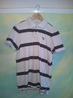
In our opening two minutes we must portray the wealthy brother as being well groomed and a neatly presented character. We have narrowed down our ideas for the characters outfit, thinking about all the possibilities of generalisations as though to have a stereotypical view on the character to be easily identified by the audience. We feel we have successfully achieved this by using labels which are well known easily identified by characters to predict on the characters persona. In this case we have chosen abercrombie as this is well recognised as being an upper class brand. Below is an abercrombie shirt;

We are currently unsure on whether to portray the character as a smart wealthy boy or a casual wealthy boy, the shirt being the smart option and below the polo shirt being the casual option.

Saturday, 2 January 2010
Location Research.
Subscribe to:
Posts (Atom)


